Different analytical views — not five variations of one dashboard.
Analytics · BI · Strategy · CRO
Analytics Report Gallery: Data Built for Decisions
Five different business questions. Five decision-ready reporting systems. This collection shows how I turn fragmented acquisition, CRM, market and behavior data into reports that explain what changed, why it matters and what the team should do next.
 Market intelligence
 Performance intelligence
GA4, CRM, Ads, Meta, SEO, market, pricing and behavior.
Executive, portfolio and channel-level decisions.
Every visual ends with a priority, owner or next move.
Selected reporting work
Not dashboards for viewing. Dashboards for deciding.
Each report starts with a real business question and ends with a recommended action. Open any preview to inspect the full visual.
Regional Market OpportunityMarket intelligence · executive view
Report 01
Regional Market Opportunity
GEO · demographics · competitors · pricing
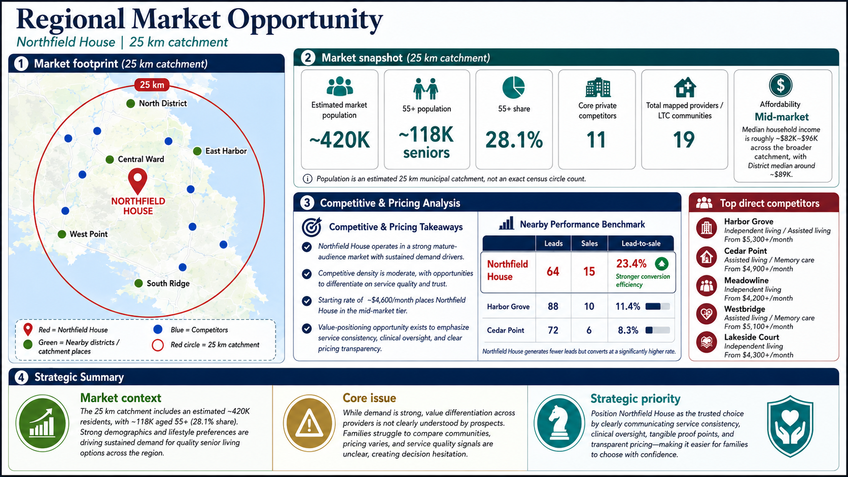
Business problem
The portfolio was investing by location, but could not see where catchments overlapped, which markets had enough demand or where pricing weakened positioning.
What I built
A 30 km market view combining population 65+, competitor density, care offer, pricing, search demand and downstream conversion.
Decision enabled3 market strategies
Grow, defend or reposition. Normalized pilot data showed an 11% lift in qualified-lead rate after budget and messaging changes.
BigQueryMarket dataGoogle AdsCRMMaps
Growth Health Command CenterWeekly operational report
Report 02
Growth Health Command Center
Acquisition · engagement · leads · sales pipeline
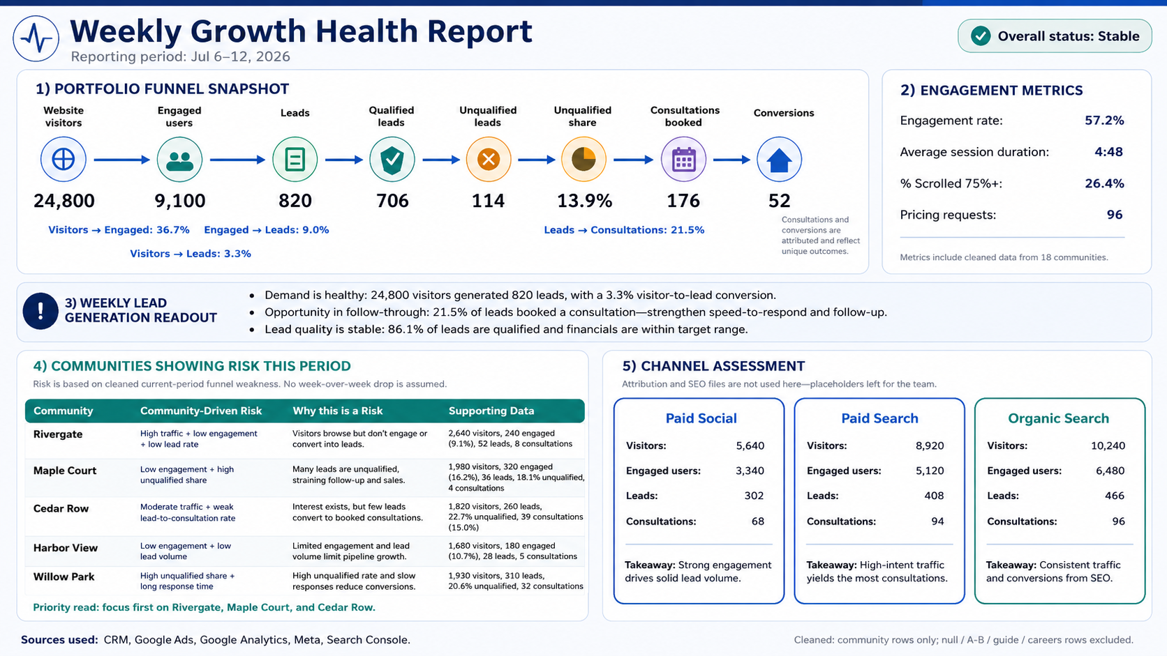
Business problem
Traffic, leads and sales outcomes lived in separate systems. A weak location could remain hidden until the monthly review.
What I built
One weekly view joining GA4, paid media, SEO and CRM, with funnel health, channel assessment and automated risk flags by location.
Operational result6 days → 24 hours
Performance issues were surfaced and assigned within one working day; the normalized pilot reduced wasted media spend by 17%.
GA4Google AdsMetaCRMSearch Console
Campaign Performance & AttributionE-commerce · campaign deep dive
Report 03
Campaign Performance & Attribution
Traffic · product mix · revenue · attribution QA
Business problem
The campaign generated engagement and orders, but campaign traffic was mixed with regular website activity, making incremental impact impossible to defend.
What I built
A URL- and event-based campaign report separating audience quality, product behavior, source mix, purchases and tracking gaps.
Business resultAttribution restored
Dedicated campaign tagging and a clean comparison group made the next activation measurable; normalized revenue per session improved 8.4%.
GA4GTMBigQueryLooker StudioE-commerce
Multi-Location Funnel BenchmarkPortfolio performance · prioritization
Report 04
Multi-Location Funnel Benchmark
Traffic · conversion · tour · closed outcome
Business problem
Portfolio averages hid two opposite failures: some locations could not generate leads, while others generated demand but failed to progress it.
What I built
A benchmark that compares volume, conversion efficiency, lead quality and sales progression and assigns the right intervention to each location.
Optimization result+0.6 pp conversion
High-performing journey patterns were replicated on priority pages, producing a normalized 22% relative lift in visitor-to-lead conversion.
GA4CRMExcelPower BISQL
Behavior & UX Opportunity DashboardProduct analytics · CRO prioritization
Report 05
Behavior & UX Opportunity Dashboard
Pages · devices · intent signals · friction
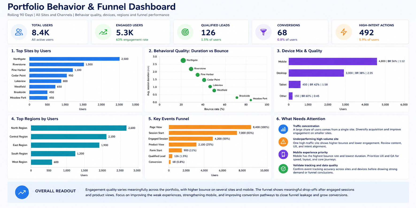
Business problem
Standard traffic reporting showed where users arrived, but not why high-volume pages and mobile sessions failed to convert.
What I built
A behavioral scorecard combining GA4 journeys with heatmaps, recordings, scroll depth, rage clicks and form abandonment.
CRO result+13.6% form completion
Five priority pages received clearer CTAs, earlier trust signals and a shorter form; normalized post-change completion increased without reducing lead quality.
GA4HotjarClarityBigQueryA/B testing
Every report follows the same decision chain.
The format changes with the question, but the analytical discipline does not: define the decision, reconcile the data, expose the pattern and make the next action unmistakable.
01Question
What decision must the report support?
02Trust
Are definitions and sources reconciled?
03Insight
What explains the performance gap?
04Action
Who changes what, and how is impact checked?